In the ever-evolving landscape of the internet, where users access websites through a myriad of devices, the importance of responsive web design cannot be overstated. As we navigate the digital terrain of 2023, the need for websites to adapt seamlessly to various screen sizes and resolutions has become a critical factor in ensuring a positive user experience and optimizing for search engines.
I. Introduction
Definition of Responsive Web Design
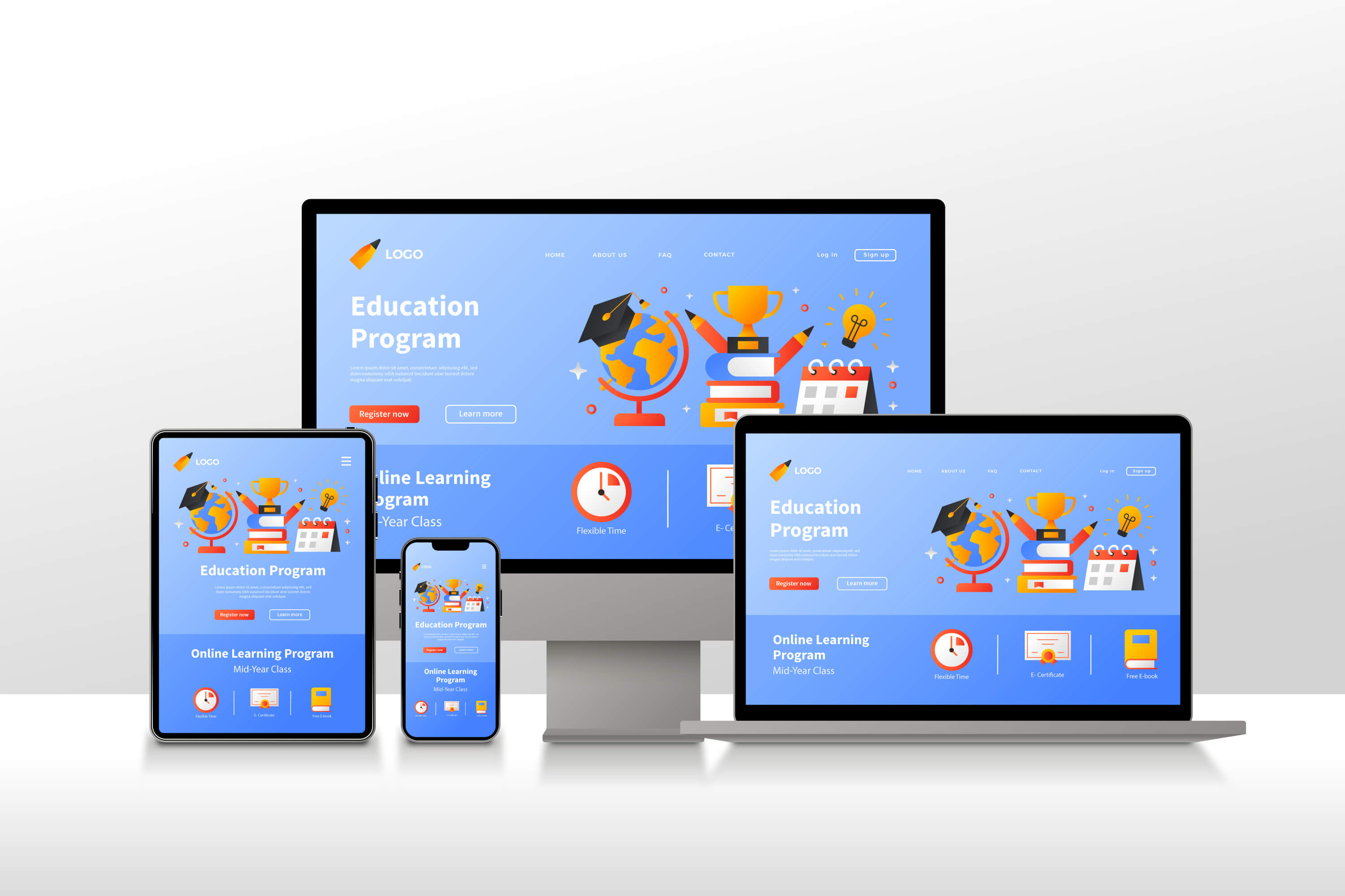
Responsive web design is an approach to web development that ensures a website's layout adjusts dynamically according to the user's device. This adaptability is achieved through a combination of flexible grids and layouts, images, and CSS media queries.
Evolution of Web Design
The journey of web design has witnessed a shift from fixed layouts to fluid grids, reflecting the changing needs of users. The evolution has led to the dominance of responsive design in the current digital era.
Importance in 2023
In 2023, the importance of responsive web design has reached new heights. With an increasing number of users accessing the internet through mobile devices, tablets, and desktops, a responsive website is not just an option; it's a necessity.
II. User Experience
Mobile-Friendly Experience
One of the primary advantages of responsive design is the creation of a mobile-friendly experience. Users on smartphones or tablets should have the same level of functionality and accessibility as those on desktops.
Consistency Across Devices
Responsive design ensures consistency in branding and user interface elements across all devices. This consistency builds trust and familiarity, enhancing the overall user experience.
Impact on User Engagement
A positive user experience directly correlates with increased user engagement. Websites that are responsive tend to have lower bounce rates and higher conversion rates, contributing to the success of businesses online.
III. SEO Benefits
Google's Mobile-First Indexing
Google, the leading search engine, prioritizes mobile-first indexing. This means that Google predominantly uses the mobile version of the content for indexing and ranking. Responsive design aligns perfectly with this approach, positively impacting search engine rankings.
Improved Page Loading Speed
Page loading speed is a crucial factor in SEO rankings. Responsive websites, by optimizing content for various devices, often load faster, leading to better user experiences and improved search engine rankings.
Lower Bounce Rates
Responsive design contributes to lower bounce rates as users are less likely to leave a site that provides a seamless experience across devices. Google interprets lower bounce rates as a signal of quality and relevance, positively influencing SEO.
IV. Business Advantages
Increased Reach and Accessibility
A responsive website expands the reach of a business by catering to a diverse audience using different devices. It ensures accessibility for users with varying technical capabilities and preferences.
Cost-Effectiveness
Developing a single responsive website is more cost-effective than maintaining separate websites for desktop and mobile users. This streamlined approach not only saves money but also simplifies updates and maintenance.
Competitive Edge
In a competitive online landscape, having a responsive website is a differentiator. Users are more likely to engage with websites that prioritize their experience, giving businesses a competitive edge.
V. Tools and Resources
Frameworks and CSS Libraries
Emulators and Simulators
- Google Chrome DevTools
- BrowserStack
- Responsinator